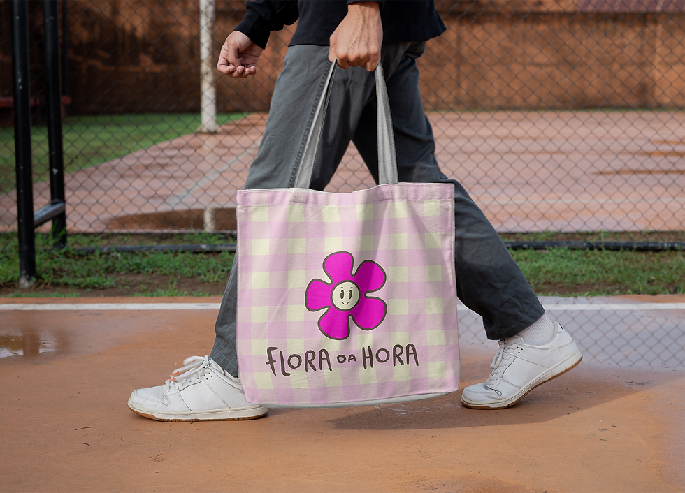
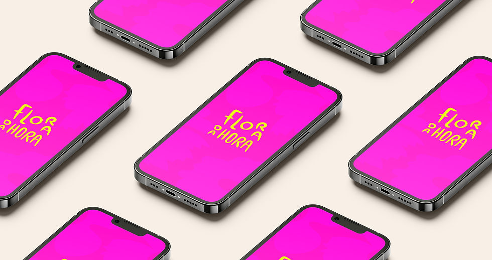
Flora da Hora
Brand creation for the Flora da Hora app, a company designed to make flowers more accessible in everyday life, encouraging conscious consumption through surprise bouquets made from florists’ surplus.
Customers simply choose the size and receive a unique, beautiful, and affordable arrangement.
With strong values around sustainability, accessibility, and support for local businesses, the brand aims to convey a sense of lightness, joy, and warmth. Its primary audience is women aged 25–35, while also reaching a broader group that values practicality, surprise, and fair pricing.
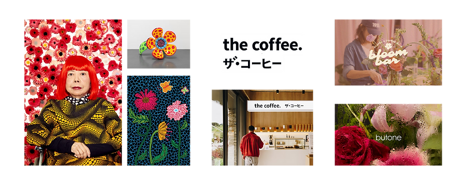
Inspired by brands like The Coffee, Flora da Hora positions itself as an everyday choice rather than something reserved for special occasions. The visual identity explores shades of pink (avoiding orange) and lives primarily in digital environments, including the app, Instagram, TikTok, and website.

References
“They noticed that different cultures focus on distinct areas of the face to recognize emotional expressions, with Western Caucasians predominantly observing the eye and mouth areas.”
Fabiano Koich Miguel
Federal University of Londrina
“They noticed that different cultures focus on distinct areas of the face to recognize emotional expressions, with Western Caucasians predominantly observing the eye and mouth areas.”
Fabiano Koich Miguel
Federal University of Londrina

Logo Construction

Horizontal Version

Typography & Color Palette

Patterns & Elements